nosm.ca Redesign Proposal
An audit, a prototype, and a pitch to the people who could say yes.
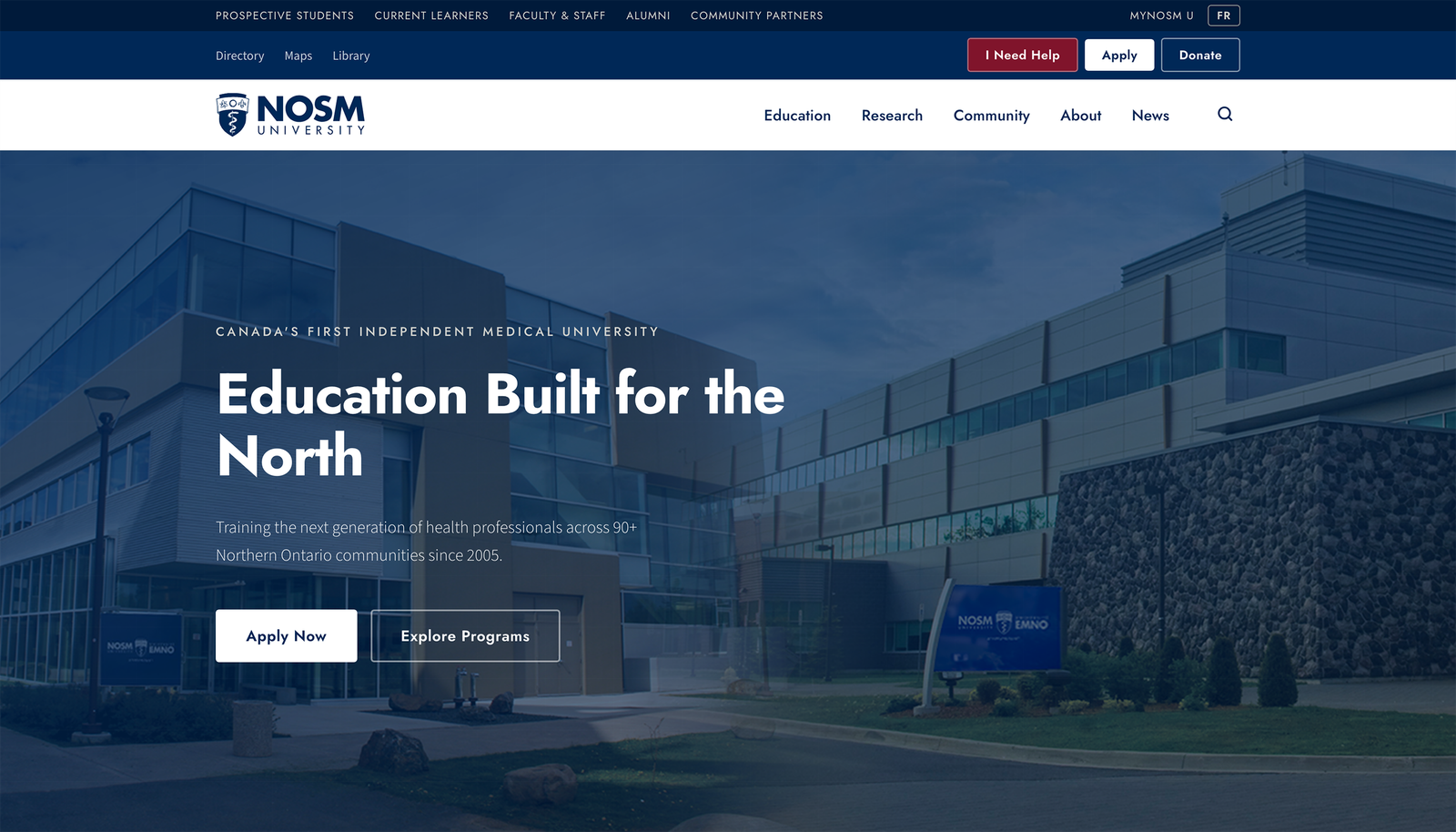
nosm.ca carries 1,900+ pages for a university of 224 students. UT Austin serves 53,800 students with a smaller site. AODA, Ontario's accessibility law, sets a high bar for public institutions, so the prototype was built to clear it at AAA. I audited every URL, pulled the analytics with our digital strategist, redesigned the homepage, coded it as a working prototype, and presented the case in person to External Relations.
1,903
rows in the sitemap audit. Every URL on nosm.ca, categorized: content, utility, auto-generated, orphaned, or dead.
Reading all 1,900 pages so nobody else has to
Legacy pages, orphaned URLs, near-duplicates. I categorized every URL, benchmarked the structure against UT Austin, and costed the cleanup at roughly 2,000 hours: one full-time employee for a year. Then I checked the analytics. A fifth of all page views land on the homepage and a third go to just three destinations. The site is huge; the traffic isn't.
Before and after
The current homepage is a news dump. The redesign leads with what the analytics say people actually come for: programs, admissions, and the three destinations that carry a third of all traffic. Navigation goes audience-first, and every design decision maps to one of NOSM's four strategic pillars.
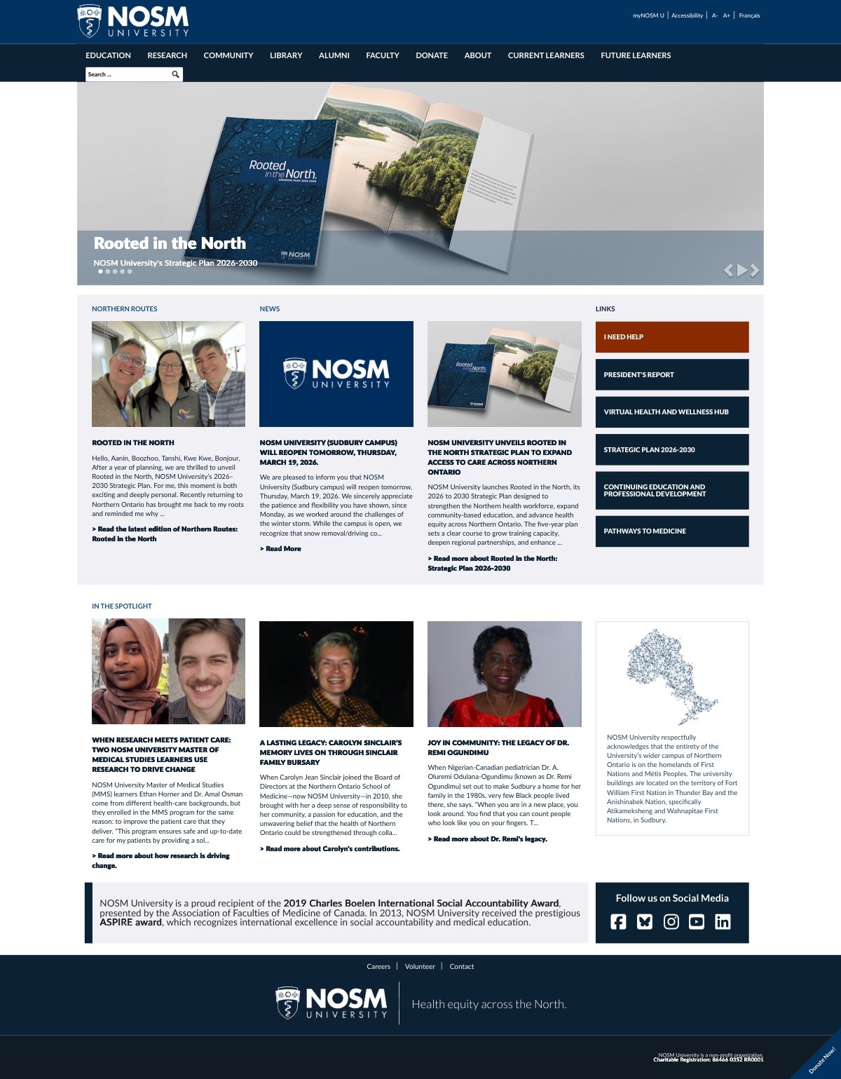 BEFORE
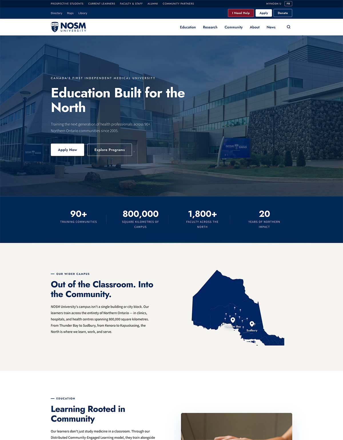 AFTER
AFTER
Built in the browser
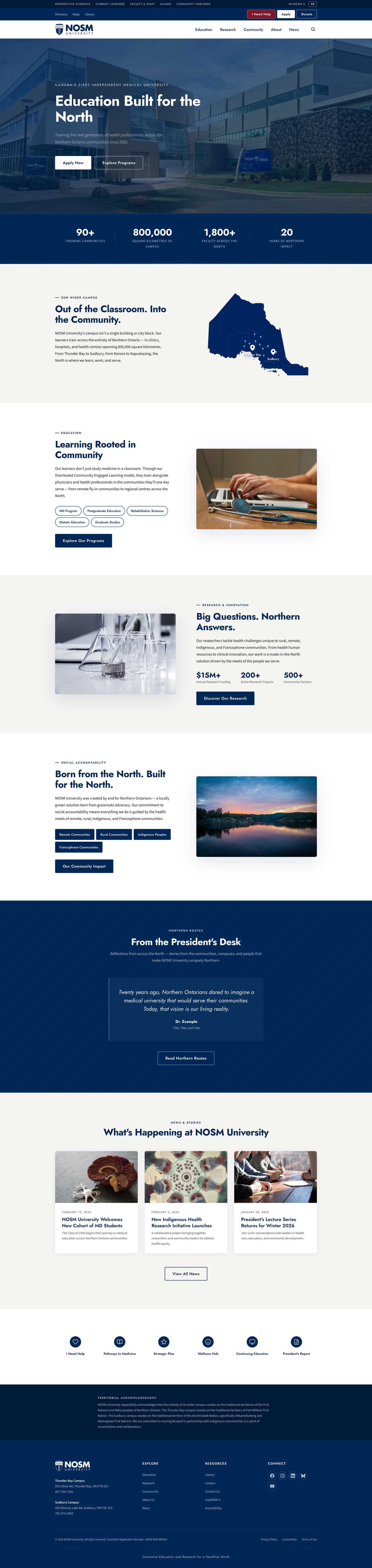
The redesign exists as a working site: semantic HTML, ARIA on every interactive element, an 18px body-text baseline, AAA contrast throughout, and a design-token system in CSS custom properties. From the pitch deck: accessibility isn't a feature, it's the baseline. Everything above it is design.
TL;DR
- Presented in person to the External Relations team, including the AVP.
- Every recommendation backed by NOSM's own analytics and a costed remediation estimate.
- Status: a proposal. The audit and the prototype exist so the university can act on them.
I read 1,900 pages before I touched the homepage. Your site probably has fewer.
Get in touch