NOSM University Rebrand
Two complete brand systems: the concept with university-wide potential, and the one the portfolio asked for instead.

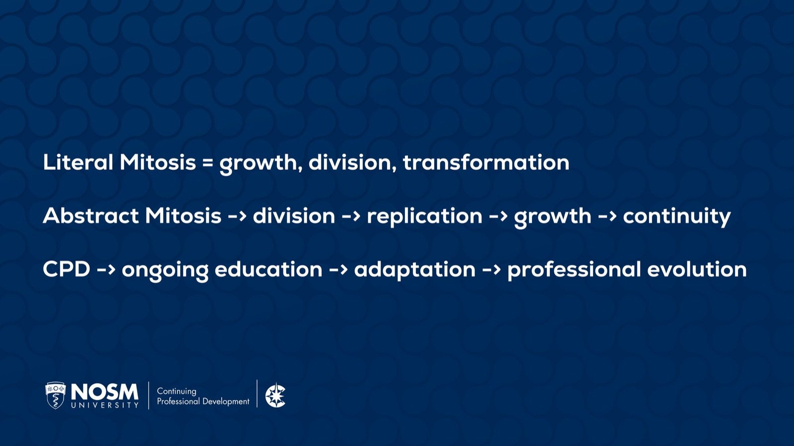
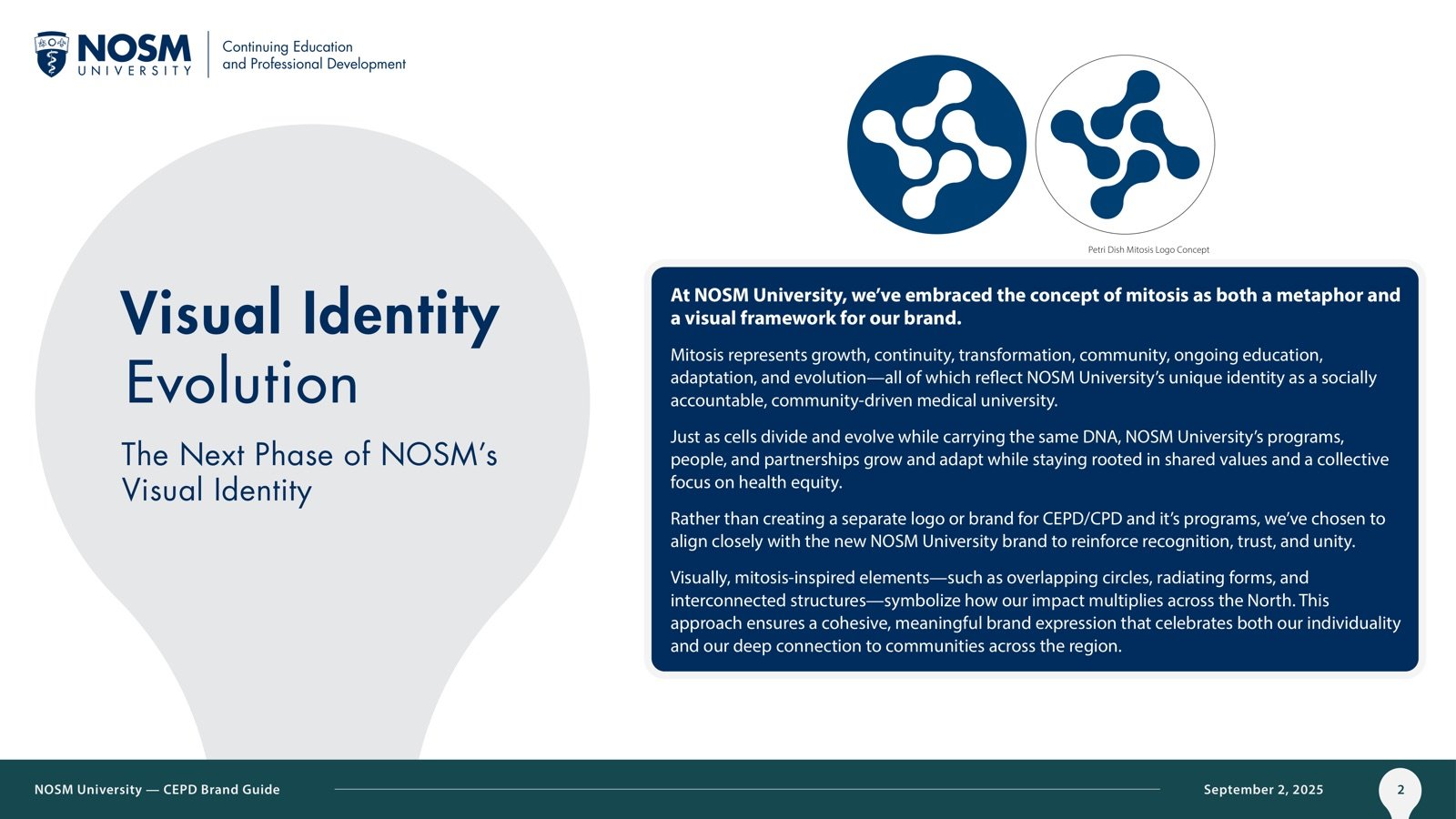
CEPD needed an identity. I pitched mitosis: cells dividing, knowledge replicating, education that never stops. The AVP of External Relations approved it and saw university-wide potential. The portfolio's stakeholders wanted something more familiar, so I built a second complete system and shipped every piece of it. This page shows both.
2
complete systems
17
brand guide slides
3+
revisions per deliverable
1
coded newsletter
Mitosis
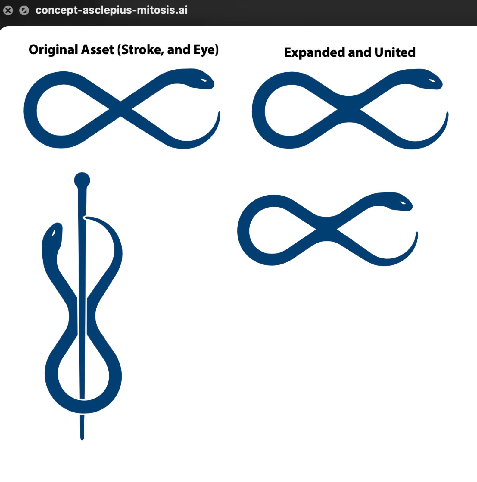
Mitosis is what continuing education looks like under a microscope. I built the idea into a visual language: a custom cell motif, a pattern library in three colourways, a colour of its own (CEPD Lakeside Teal, picked for the lakes and argued for its contrast ratios), and a 17-slide brand guide.


Approved upstairs, shelved in the room
The AVP saw university-wide potential and said so. The portfolio's stakeholders wanted a visual register their audience already knew. That's the job sometimes. The concept isn't dead; the university just hasn't organized around it yet.
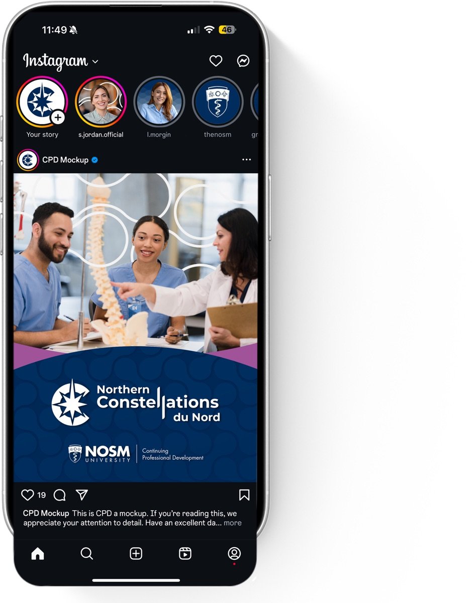
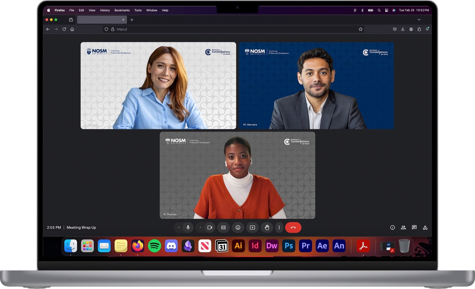
The system that shipped
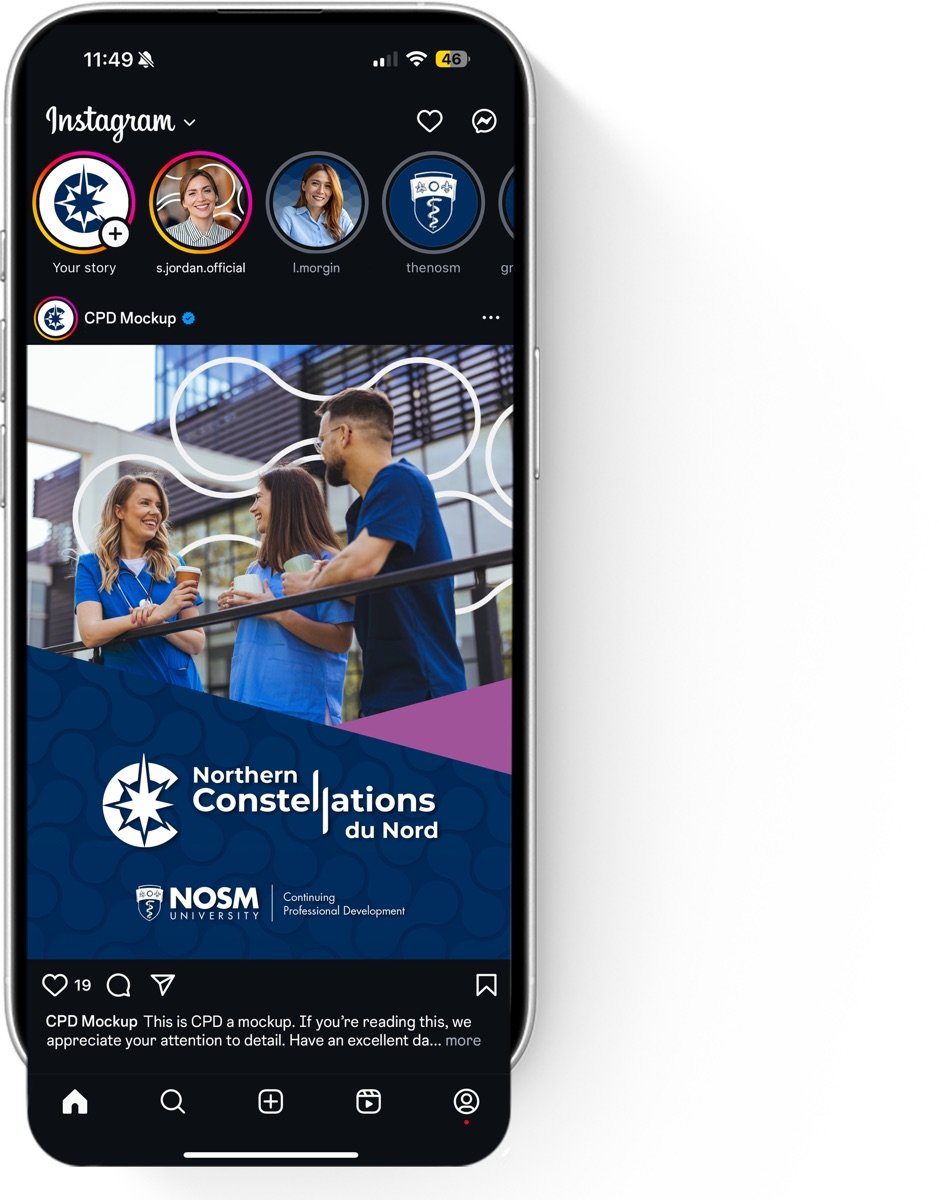
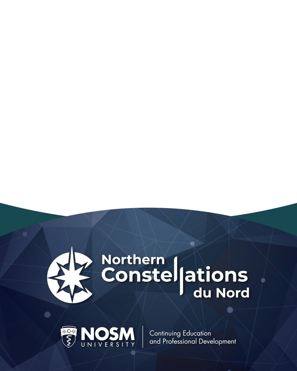
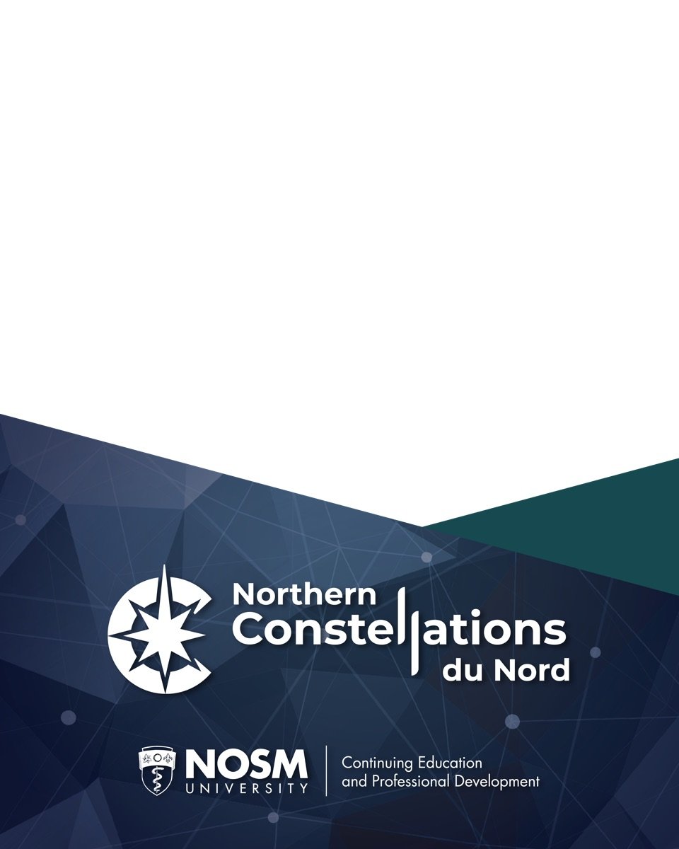
Losing the pitch didn't cancel the work. The second system covers everything the portfolio needed: save-the-date banners through five revisions, six video-conference backgrounds, microcredential flyers, eight social templates, a reusable PowerPoint template, and a conference kit for Northern Constellations.



Built like it's 1999
The newsletter is HTML I wrote by hand, table layout and all, because email clients don't care how good your Figma file looks.

TL;DR
- The full CEPD template suite shipped and is in use.
- The mitosis concept holds AVP-level approval for future university-wide work.
- Nearly every deliverable went through three or more stakeholder revision rounds.
I ship the fallback as completely as the pitch.
Get in touch